FES Asia-Pacific
Feminist Glossary
Introduction
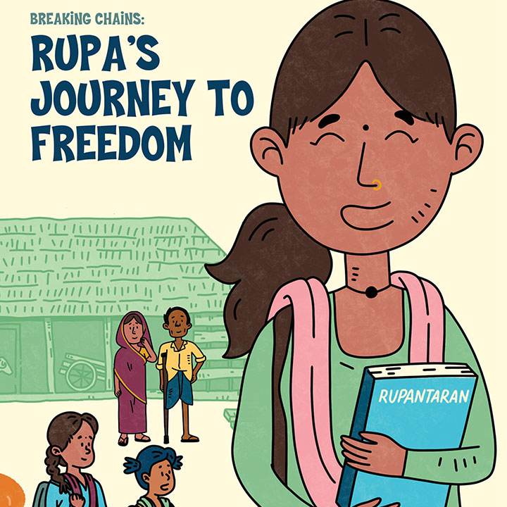
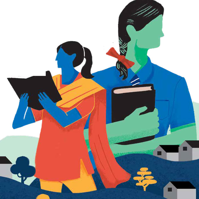
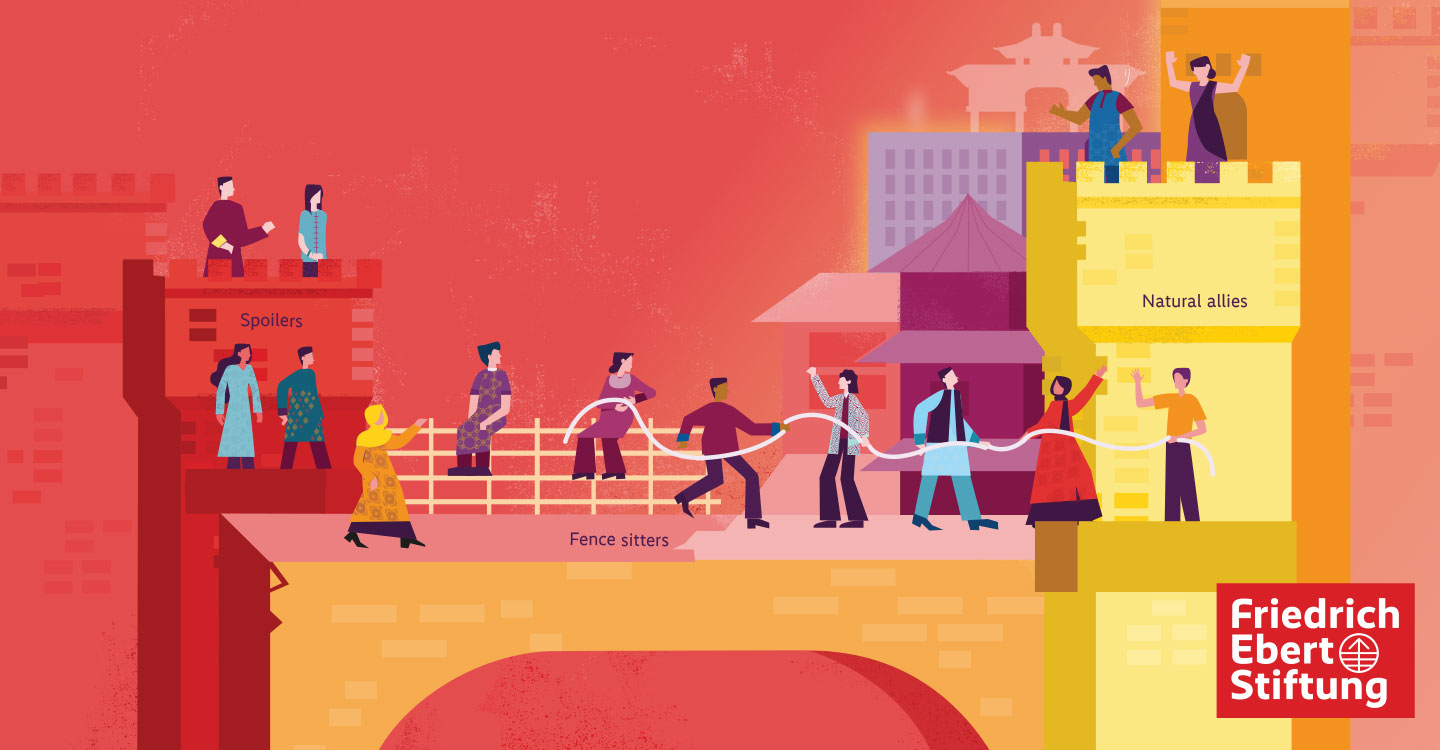
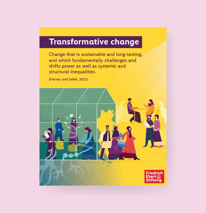
Kazi Studios was engaged to create the visual design for this initiative, which is intended for use across global platforms and audiences. The objective was to develop a cohesive visual identity and a series of high-quality illustrations for International Women’s Day/Month that make complex feminist and gender-transformative terminology more accessible, relatable, and easy to understand for the wider public. The project aimed to translate advocacy language often limited to academic, policy, and development spaces into clear visual communication that could be used internationally while remaining aligned with FES branding guidelines.
Challenge
The key challenge was that many concepts related to gender justice, equality, and feminist advocacy are often communicated using technical language that can feel distant or difficult for the general public to connect with. As a result, important ideas risk remaining within specialist circles rather than becoming part of broader public understanding. The project therefore needed to bridge the gap between complex terminology and everyday language, while ensuring that the visuals remained sensitive, engaging, and impactful. Another challenge was to maintain consistency across multiple formats and deliverables — including social media posts, story assets, and website banners — so the campaign would feel unified across all touchpoints.
Solution
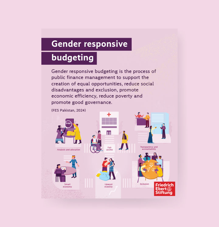
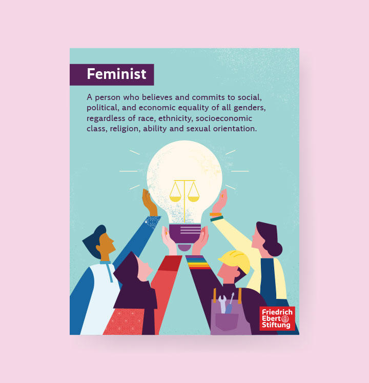
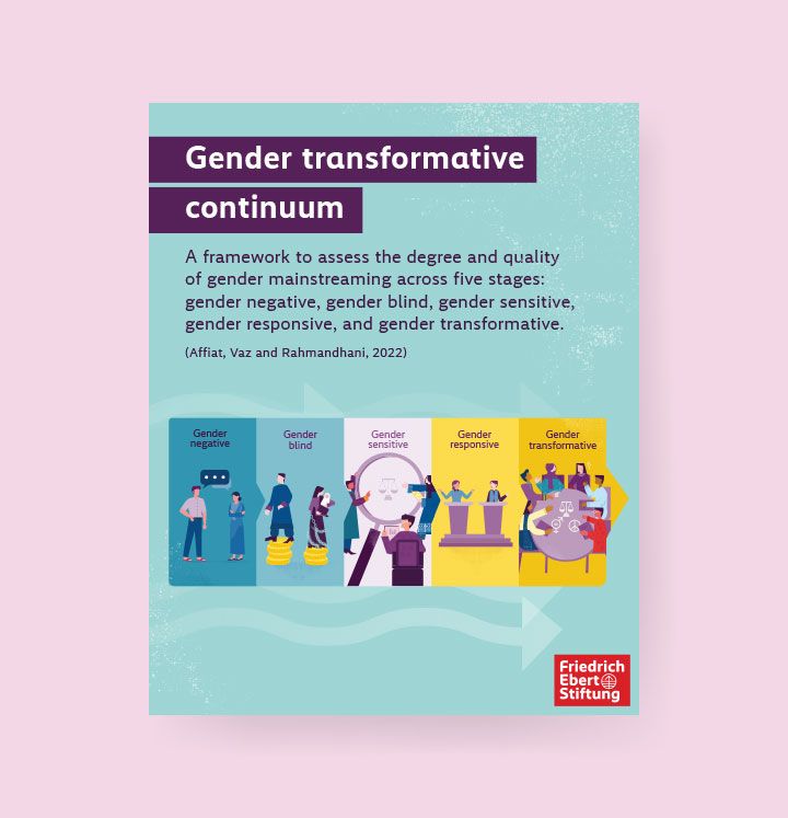
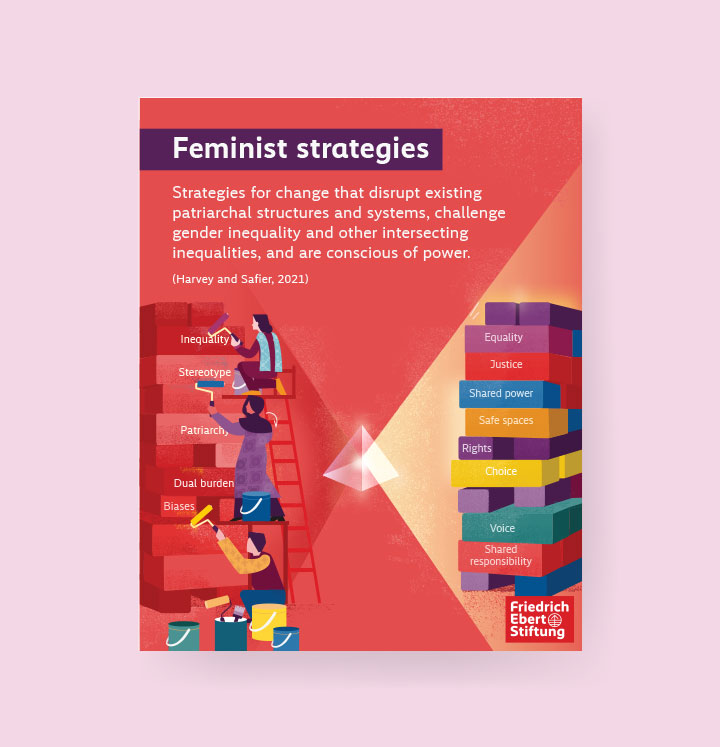
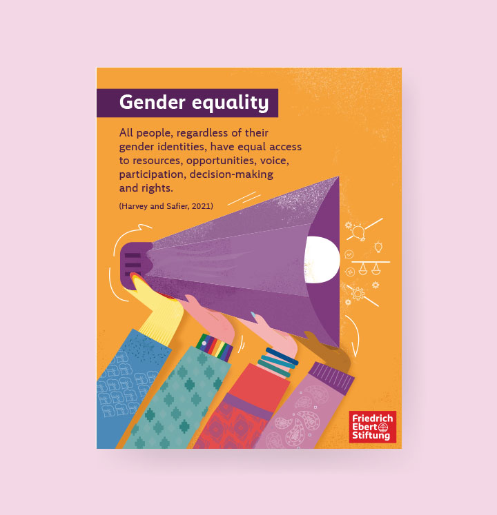
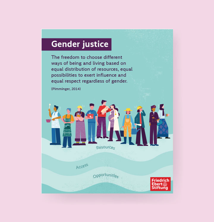
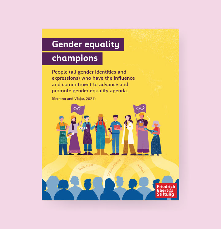
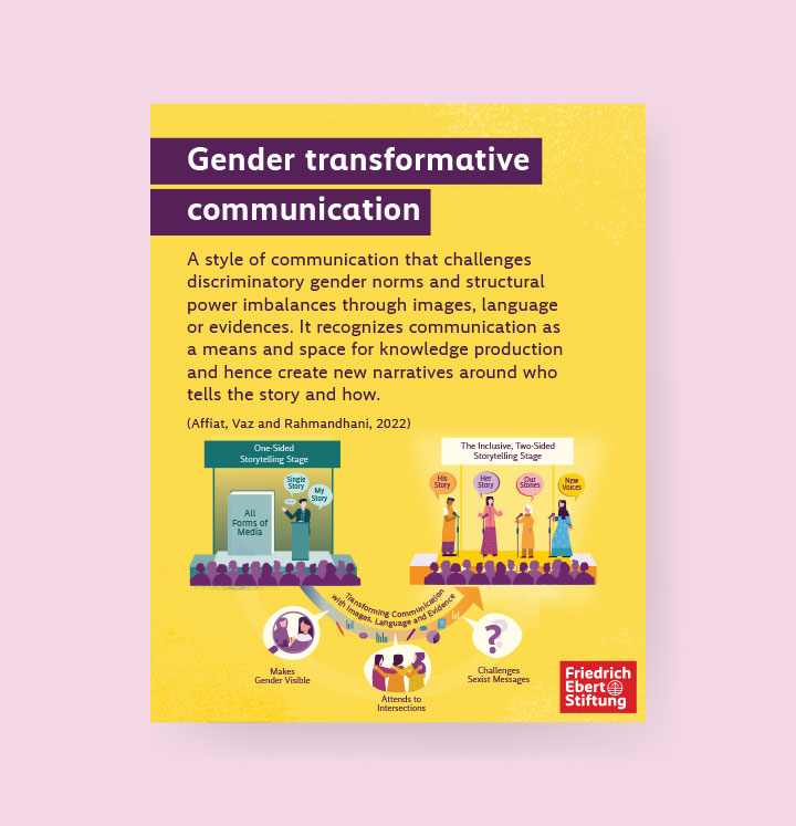
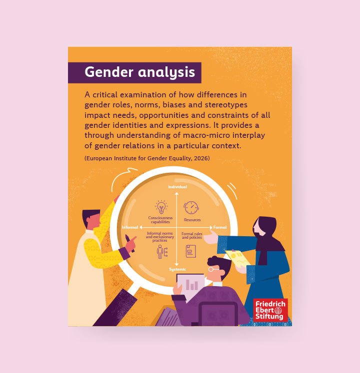
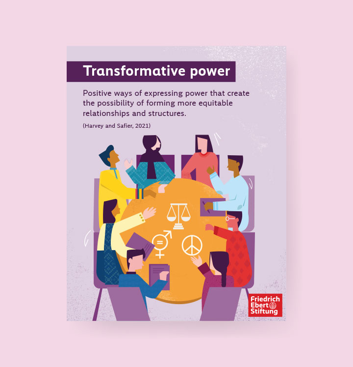
Kazi Studios created a cohesive visual system and illustration series designed for global use, translating 16 feminist and gender-transformative terms into clear, accessible, and visually engaging content. Based on the definitions and concept directions provided by the FES team, custom illustrations were developed to simplify each term into an everyday visual narrative that audiences across different contexts could easily understand and relate to. This visual system was then extended across supporting campaign assets, including Facebook and Instagram posts, Story backgrounds, and a website banner, ensuring consistency across all touchpoints. The result was a unified campaign identity that made complex gender justice concepts more approachable and relevant for audiences worldwide.